For some reason, hockey seems to have more cult-classic teams than other sports. What makes a cult classic? To me it’s a short-lived franchise with a bold aesthetic identity who’s lasting popularity dwarfs its winning percentage. (Yes, I’ve thought about this a lot.)
All North American leagues have the skeletons of extinct teams in their closets, of course, but the NHL’s are different… they have this “aura” about them. Four prime examples from hockey history are: the Minnesota North Stars, California/Oakland (Golden) Seals, Hartford Whalers, and Quebec Nordiques. All of these teams had bold – some might say garish – logos and colours, did more losing then winning, and moved or went bust. And they are all celebrated today, despite, or because of, these factors.
We’ve talked about the North Stars, Seals, and Whalers before in some capacity, so it’s time to look at the Nordiques. Still the only major-league team Quebec City has had, the Nordiques are technically alive today; the franchise moved and became the Colorado Avalanche. But it’s safe to say most from Quebec did not follow the team south. This relocation was particularly cruel for Nordiques fans as, in the franchise’s first season in Colorado, 1995-96, the Avalanche won the Stanley Cup.
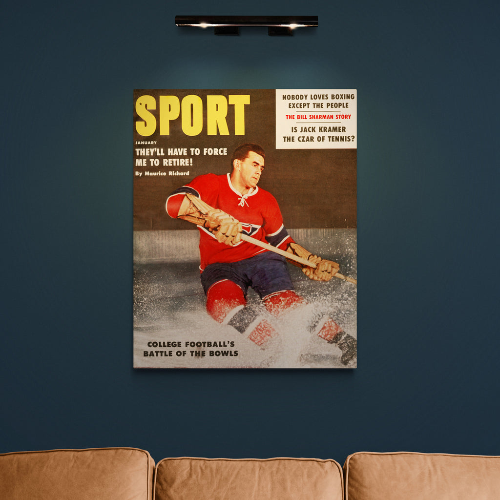
The Nordiques – “Northmen" or "Northerners” in English – began as a World Hockey Association (WHA) franchise in 1972. Fun fact: the team’s first-ever head coach was Montreal Canadiens legend Maurice “Rocket” Richard. He led the team for only two games, however, before stepping down for personal reasons. The Nordiques were a success in the WHA without Richard, making at least the quarter-finals in four out of six years. And they won it all, against the Winnipeg Jets, in the 1976-77 season.
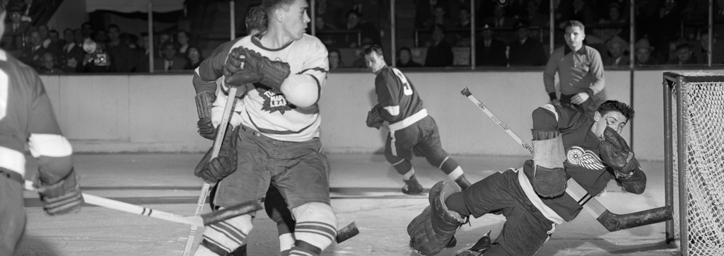
Before the 1979-80 season, the WHA, which was in vigorous competition with the NHL, settled and merged with their rivals. The Nordiques, plus the Whalers, Jets, and the Edmonton Oilers, became NHL clubs. During their 16-year stay in the NHL, the Nordiques would be best known for three things: iconic uniforms, a proud handful of stars, and massive fights with the in-province rival Canadiens.
Hockey as a sport is known for beautiful “sweaters,” and the Nordiques' might just be up there with the best. Their colourway, baby blue and red, was quite unique at the time. Their primary logo, an igloo cut diagonally by a stick and puck, was perfectly simple. And their secondary logo, the fleur-de-lis, which wrapped around the base of the shirt and dotted the shoulders, was the piece de resistance. The Nordiques, aesthetically, broke ground while staying classy. Behold:
Six future-Hall of Famers would wear the uniform. Guy Lafleur, who won five Cups with the colossus Canadiens of the ‘70s and ‘80s, spent the last two years of his brilliant career with the Nordiques. Joe Sakic and Mats Sundin began their careers there, but would become known for their time with different cities. As did Peter Forsberg, who played his just rookie season with the Nordiques before moving with the franchise to Colorado. Michel Goulet and Peter Stastny were mainstays, as they spent a combined 21 seasons in Quebec City.
If you were a Nordiques player, your career with the club was certainly marked by games against the Canadiens – the “Battle of Quebec,” they called it. Like most great sporting rivalries, this went beyond the box score. Quebec City is the capital of the province and is the core of francophone culture. Montreal is the larger, more metropolitan city, which makes it a melting pot of sorts. Thus, to many, the Nordiques came to represent the separatist movement, while the Habs were more the nationalist team. To complicate matters further, the two teams were owned by competing breweries: Carling O’Keefe (Nordiques) and Molson (Habs).
Montreal and Quebec met five times in the playoffs, with the Canadiens taking three of the series. These high-octane meetings came to a head in 1984, in game six of the second round – “The Good Friday Massacre.” It was essentially a full-game, bench-clearing brawl that left 11 players ejected and produced a total of 252 penalty minutes. The second period never finished, technically, and fighting began again before the third could start. Hands were bloodied, noses were broken. Jean Hamel, of the Canadiens, was knocked unconscious. A massacre indeed.
By the ‘90s, the Nordiques were starting to struggle financially. Rising player salaries was a major problem, especially given Quebec City was already the smallest market in the league. And there was the language barrier – unlike Montreal, Quebec City was largely monolingual. This made it a less-desirable destination for English-speaking players. Eric Lindros is a good example; he was drafted by the Nordiques in 1991 but refused to play. All of this, combined with the political climate and the upcoming referendum, lead to the NHL to find a Stateside home for the team. Nordiques fans kept turning out, but in the end it was not enough.
Sadly, we’re 15 years down the road and NHL hockey has still not returned to Quebec City. There is a fancy new building, the Videotron Centre, which currently houses the Remparts, a minor league team in the Quebec Major Junior Hockey League. Many thought that, when the NHL granted Las Vegas a franchise in 2016, Quebec City would finally get their team back, to balance things out at 32 franchises. But, instead, Seattle got the vote.
The Nordiques legacy still lives on, though, through their fans. Many travel in groups to NHL games in order to make their presence felt. And the team’s aesthetic remains compelling today, and so new fans are made. The Nordiques are officially a cult-classic – gone, but certainly not forgotten.